Updates: Interface and accessibility
Hello everyone! Throughout the past year there has been a lot of work in creating a polished, modern looking UI. This update has been in the works for a long time... Many considerations had to be done, and given the current state of modern browsers (and their over-reliance in JS) many more surfaced, leading to further testing and fixes.
We hope you like it!
The prime directive
Modern looking, consistent and accessible UI across all browsers. Non-JS version as the primary focus, JS is optional and should be regarded as such.
The Web is 95% typography, the art and technique of arranging type to make text more readable and pleasing. To achieve this, a textual hierarchy is fundamental, text should present a clear, readable structure to the reader. In much of the same fashion, the way we perceive Web pages relies upon the same fundamentals. As such, by focusing on the markup, we hope to achieve an accessible, fast and polished structure by which any browser and screen reader relies upon.
Features
- Accessible
- Easy to use keyboard only navigation
- Feedback on focused elements
- Keyboard shortcuts to access main regions
- Vi-like shortcuts
- Screen reader tested
- Notifies the user when focusing on key elements, such as the feed, notes and actions
- Brief description of navigation links
- Using semantic HTML whenever possible
- Special care given for styling solutions that could break accessibility
- Colors and type sizes in accordance to W3C contrast guidelines
- Chosen specifically blue-ish and grey-ish hues for faster page loading perception
- Fast, the content provided to the user really is just markup and some CSS rules
- Optionally there will be some small use cases where JS makes sense (it's the only thing modern browsers understand e.e)
- For example, cropping your avatar before uploading a new one.
- This is the only example until now.
- Dark and light default themes available (according to your system theme)
- Graceful degradation for unsupported HTML elements
- Achieving modern user interface patterns without JS
- Various layout engines tested and work as they should
- Qt WebEngine (Qutebrowser, Falkon, Otter Browser, etc...)
- WebkitGTK (Epiphany, Midori, etc...)
- Gecko (Firefox and derivatives)
- Goanna (Palemoon, Basilisk, etc...)
- Internet Explorer
Video
Keyboard tests
Images
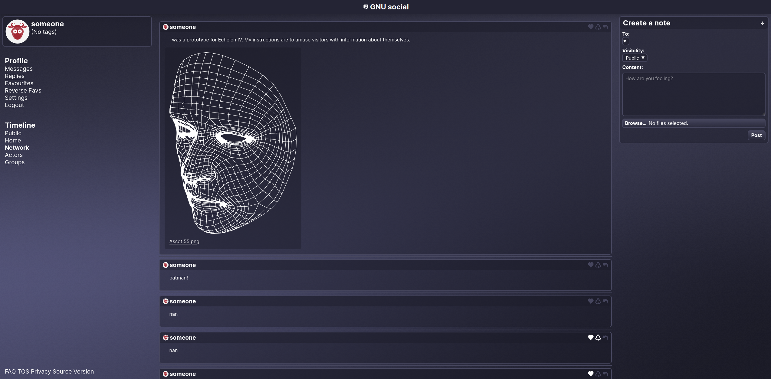
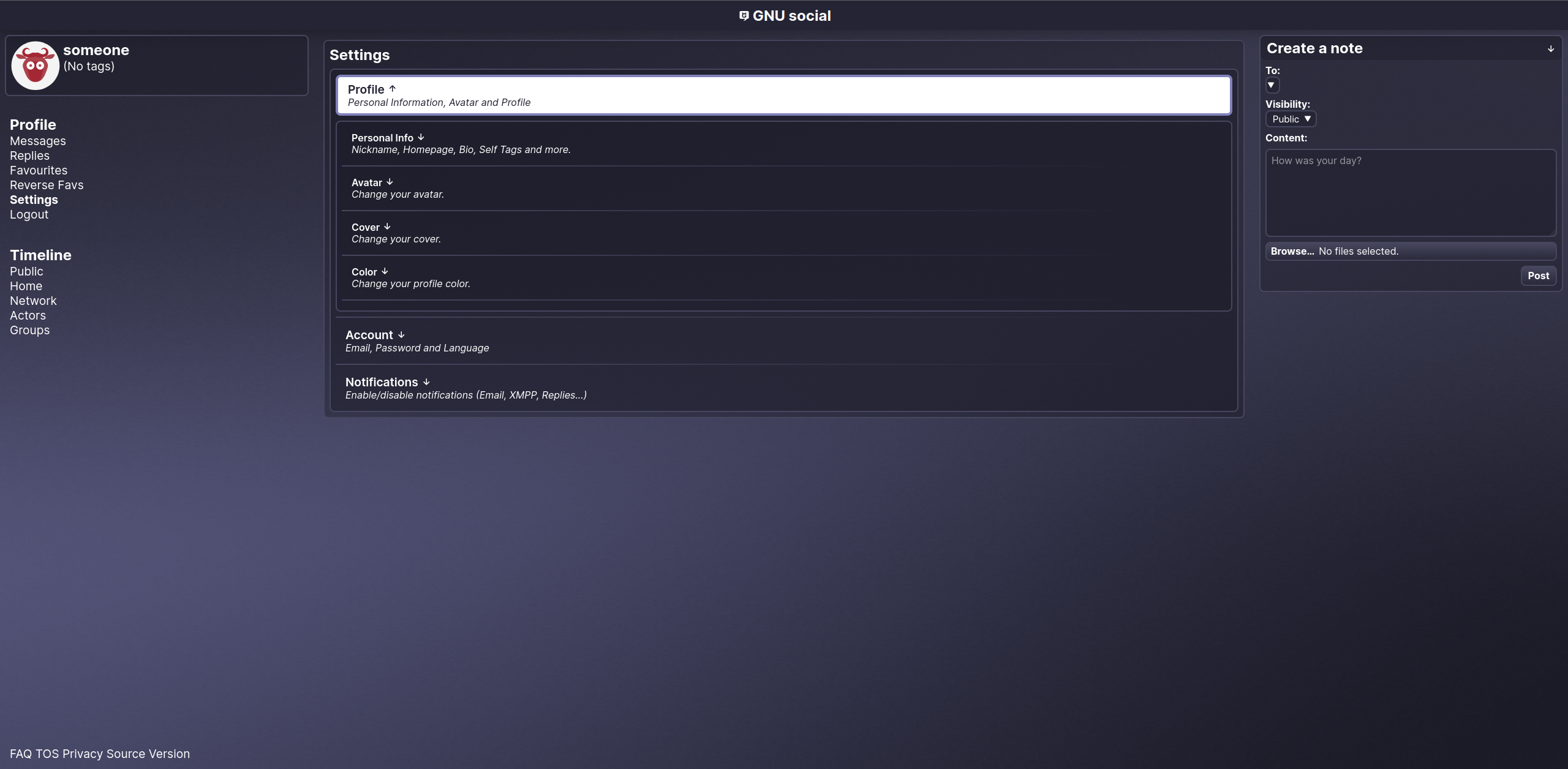
Default dark theme


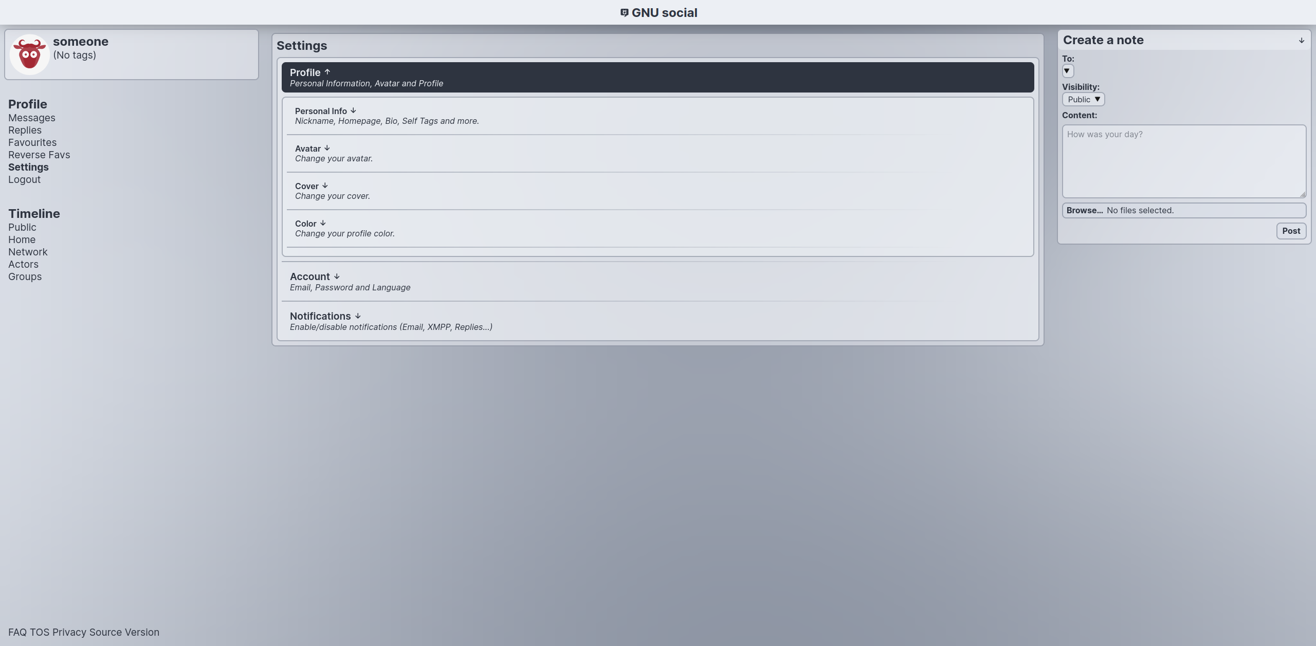
Settings are re-organized, allowing to focus into view each "tab" using the details HTML element.
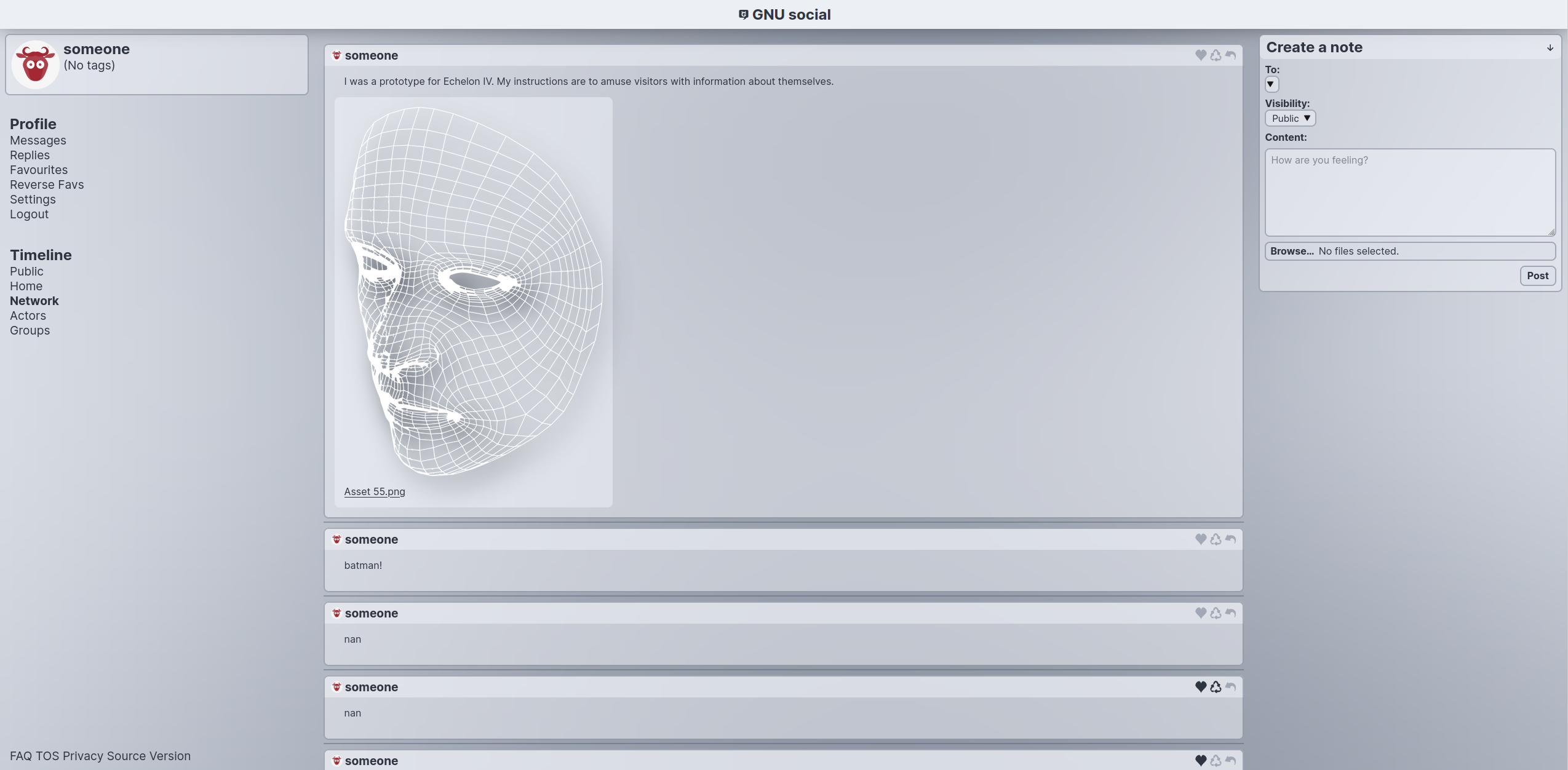
Default light theme


 gnusocial